“Net Artist Dev On Geocities, Activist Art And Vaporwave”
Dev (b. 1990) is an artist who spent a lot of time on computers growing up. Much of what he makes taps into 1980s Apple and 1990s brutalist web nostalgia. His online life is more or less dedicated to accumulating cool, disturbing, weird, erotic, and horrifying pixxx, all organized into barely-legible categories.
Dev's NewHives are an extension of his curatorial leanings and focus on color-relational aspects of found and made images, as well as surrealist collages: primarily composed of old web-inspired threshold and bitmap art.
Dev graduated from UNC-Chapel Hill with a degree in history and currently helps manage an independent cafe-bookstore in the Boston area. He lives with his partner and hamster in a nest of books, magazine pages, found pictures, newspapers, zines, and other printed matter. He also writes film reviews and is deeply invested in human/LGBTQ rights work. We talked to Dev about old Mac aesthetics, Geocities, the intersection between art and activism, House Bill 2, egalitarian art spaces, and his hamster.
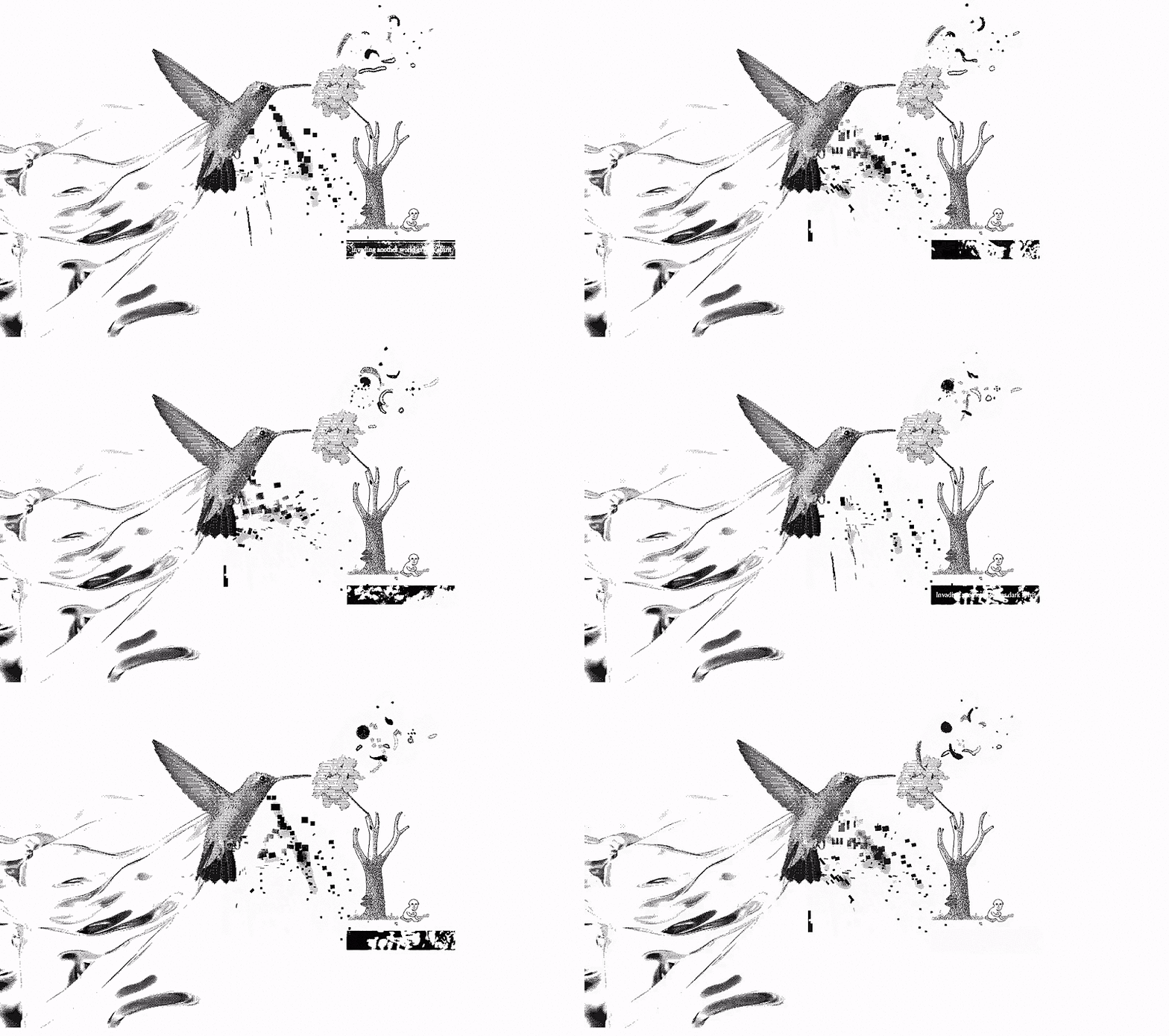
DARK SPIRIT by DEV
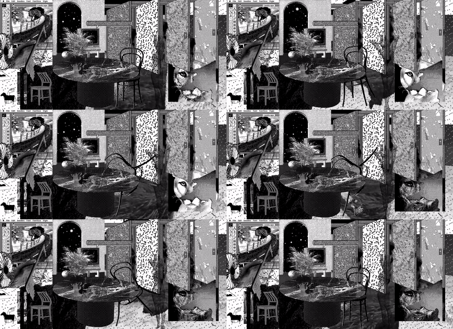
BITWORLD by DEV
How do you start one of your pieces? Is there ever a primary image that inspires you or is it more about a relationship between multiple found images?
It can sometimes be one or the other, or even something broader than either of those things. 'Bitworld' was inspired by the works of the Memphis Group, for example. As a design group, their work was very influential to 90s home and business decor, which is why I tried to use these images to create something like a home-y environment with furniture, everyday objects, doorways, etc. So anything that I've saved which would 'fit' a theme of household objects, yeah, I would use for something like that. To me it's sort of like putting a puzzle together. And sometimes it may be a single image that inspires me. I'll see it and am instantly drawn to it. Then I think of the different possibilities in working with it, whether it's color, theme, texture, or something else, and can start looking elsewhere for things to match or complement.
Some other pieces are made because I've pre-sorted images; I discovered that this particular Vaporwave holographic aesthetic was becoming popular on Tumblr and elsewhere, and I ended up saving a lot of images that resembled each other in some key ways in 'holoshit'. I just thought to myself, 'hmm, my downloads folder is overrun with these things that look alike, so what if I collected them someplace?' Some of these pieces are "collections" more so than "creations", though some artistry from me goes into arranging things in particular ways, too, I guess. I also make collages occasionally offline, and I feel like those involve more legwork from me in terms of specifically catering images to work with one another in special ways. I rarely edit anything about the images I save online. If I want something specific or to fit better I just make it myself.
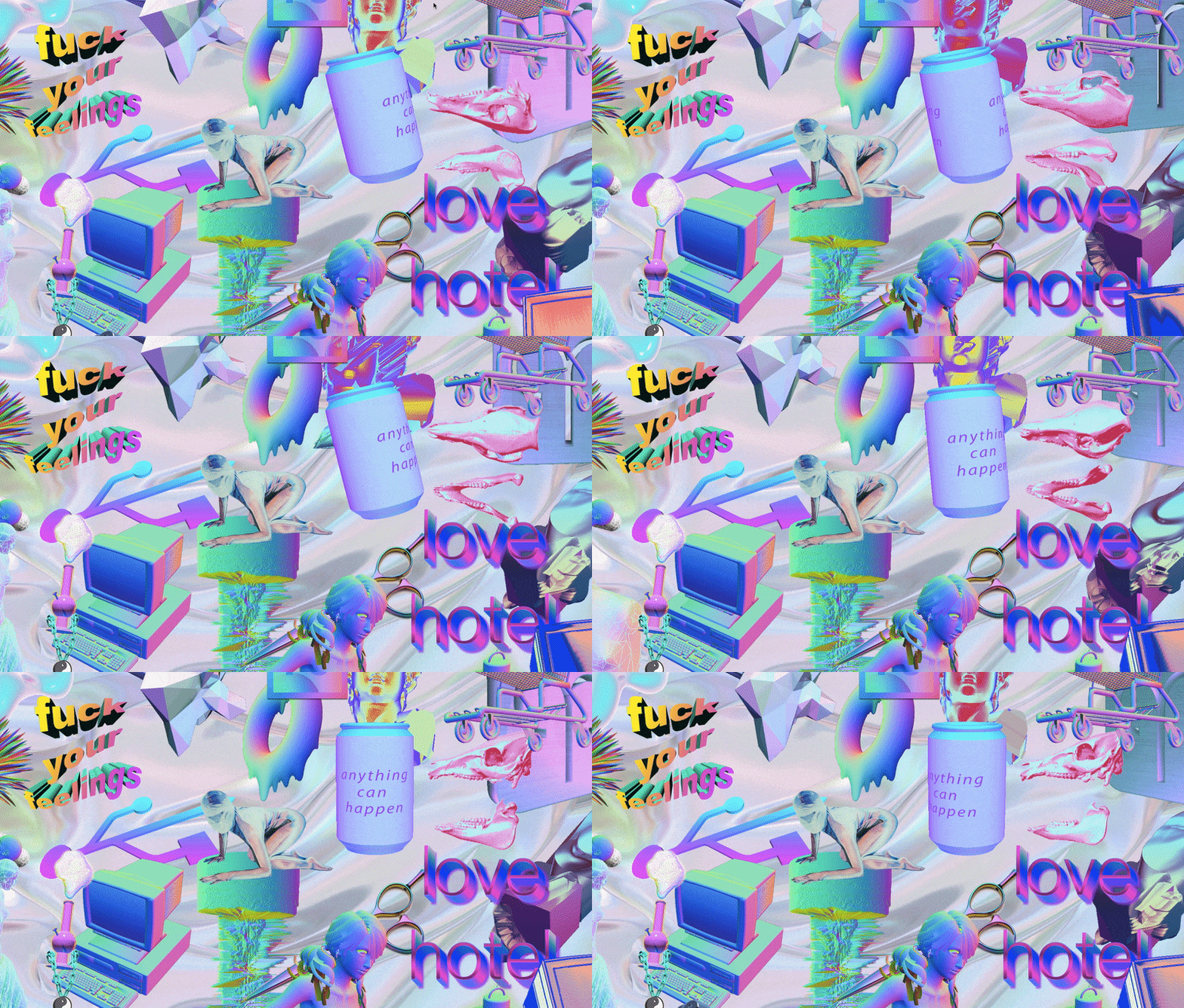
HOLOSHIT by DEV
Many of your works utilize a monochromatic color scheme. Is there something about using a limited color palette that allows you to delve deeper into other aspects such as texture?
Oh yeah, absolutely! I love limited color palettes for just that reason. I've always been drawn to the visuals of Mac System 1, which was purely black and white but incredibly beautiful. MacPaint in particular allowed for an amazing range of texture and pattern creation. I have an emulator of it and it's wonderful; it's something that will never get old to me. I think there's this idea that the artistry of operating systems and computer graphics is ever-evolving in a better direction, but that's not necessarily true when you look back at System 1 and similar. There's something in particular about black and white that just seems unreal, but in a great way. I think I agree with David Lynch when he once said, "black and white takes you kind of far away." Bitmap art with limited color or colorless schemes has that impact on me, too, even though he was speaking of film.
If I make something with a "red" theme, I think part of the fun is seeing how stretched the color "red" can be, visually. You can have a thousand different reds which are still somehow recognizable as such. I really admire the fashion of Iris Apfel as an example of this. She can wear 20 different teal accessories but they're all very visually distinct and look great together. I love seeing people accessorize many different things of the same general color, which is why I really am drawn to digital collaging using the same idea. It allows so many more aspects of an object to be explored. It's always fun for me because I rarely have any pre-conceived ideas about how these things will work together. When I think something looks good I just stop messing around, but I'm very much driven by casual experimentation.
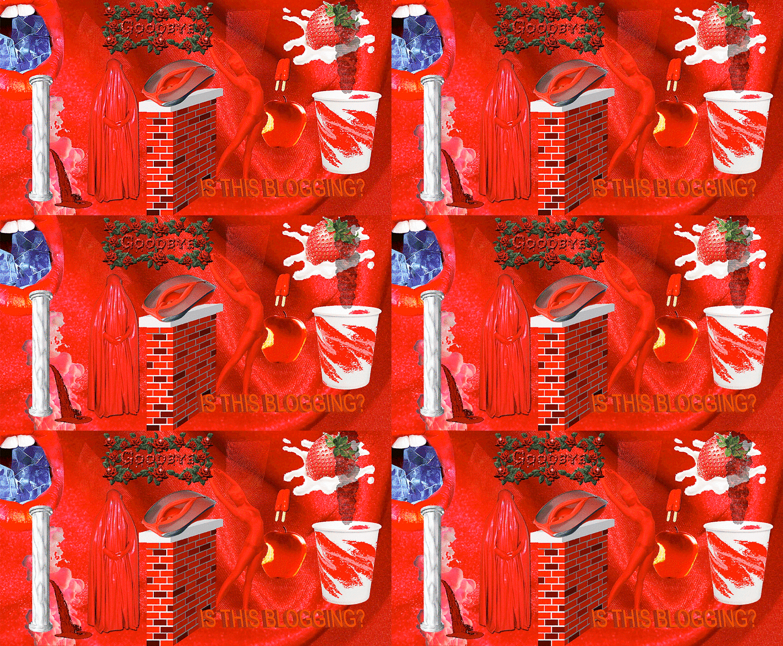
RED by DEV
What are your favorite aesthetic qualities about 90s Internet?
There's this sort of unpolished, brutalist, surreal aspect of it that's easy to replicate but hard to pin down. I really enjoyed GeoCities. Terribly designed websites with eye-searing blinking cursors, badly compressed backgrounds, strange color schemes, digital guestbooks, and anime character shrines. It was mostly interesting because they were amateurish. The people who made these clearly had limited design experience and just thought throwing together a bunch of interesting things was the way to go. (Which is definitely something I do and have always done.) Though even professional designers didn't really know what to do with websites throughout much of the 90s. It was uncharted territory and everyone was just struggling to make their brand or company relevant with no clear ideas about usability, color theory, or any of that. The Space Jam website from 1996 is still online; you can visit it, and it's awesome because it looks just as good as something some of my school friends would have put together on their home desktops.
I think it's endearing, in a way. It's almost vulnerable. I think that's why people are so attached to that very rough and undeveloped aesthetic and are bringing it back in the design world. It's almost an anti-aesthetic, where people put things together with nearly no regard for design principles or attractiveness just because they like the separate parts. What's also enjoyable to me is that so much of this stuff is still out there, just a little under the surface. If you comb through unprotected web directories of old businesses, universities, and that sort of thing, a lot of this stuff is still saved there and accessible. Tons of weird internet shit that I've saved— clip art, weird gifs, bitmaps —are from directories that have just been completely forgotten about, like the stuff in someone's attic.
Old Windows themes are also a great example of 90s aesthetics...I wonder if anyone out there ever selected 'hot dog / hot dog stand' and just used it day-to-day. It's probably retina damaging.
Is there an overlap between your human and LGBTQ rights work and your art?
Yeah! Well, first of all, I think humans are naturally drawn to art and want to check it out, so it's really a great way to get people invested, as cliché as that probably sounds. I'm involved politically / socially offline, but online I also do a side project with a friend ("wrothgod") which I think taps into this a little bit.
It's a different NewHive, which features pieces that more explicitly deal with gender identity and related social struggles and expectations. It's a way of blowing off steam and making cool things that can more easily convey these ideas and anxieties without getting too bogged down in wordiness or terminology. It feels like making digital zine pages, in a way. I love zines but I don't think I'm the sort of person who's capable of effectively communicating via text in them. People can be very weird about language, too. What was acceptable as a term 10 years ago is now considered dated or even offensive. Images can often convey a timeless idea easier than words can in a way that's less alienating.
I'm from North Carolina originally and House Bill 2 has, as almost anyone who watches the news can tell you, stirred up a lot of discontent there in the transgender community. It's a travesty, to say the least, and it's deeply personal to me because part of the reason I now live in the Boston metro is due to the systematic discrimination my partner and I faced in NC. HB2 was something I kind of made on an angry whim. I wanted to do something with it more important than just make a snide newhive, so you'll find a link inside to EqualityNC explaining what you can do to support people dealing with the reality of HB2.
Some of the stuff on my own NewHive, like 'webmeat', is a very informal jab at things like the pornographic commodification of transgender bodies and exaggeration of transgender genitalia for sexual fetishism. It's something that's been ever-present for trans women to a much larger cultural extent and for a much longer time than trans men. But I recently noticed this strange phenomenon online of men photoshopped with vaginas as a sexual fetish — "altered men". There are whole Tumblrs dedicated to it. Outside of the political and social qualities of this stuff, many of these photoshops are disturbingly hilarious, like the people doing them don't quite know how vulvas work or where they even go on the human body. It's very funny in addition to bewildering.
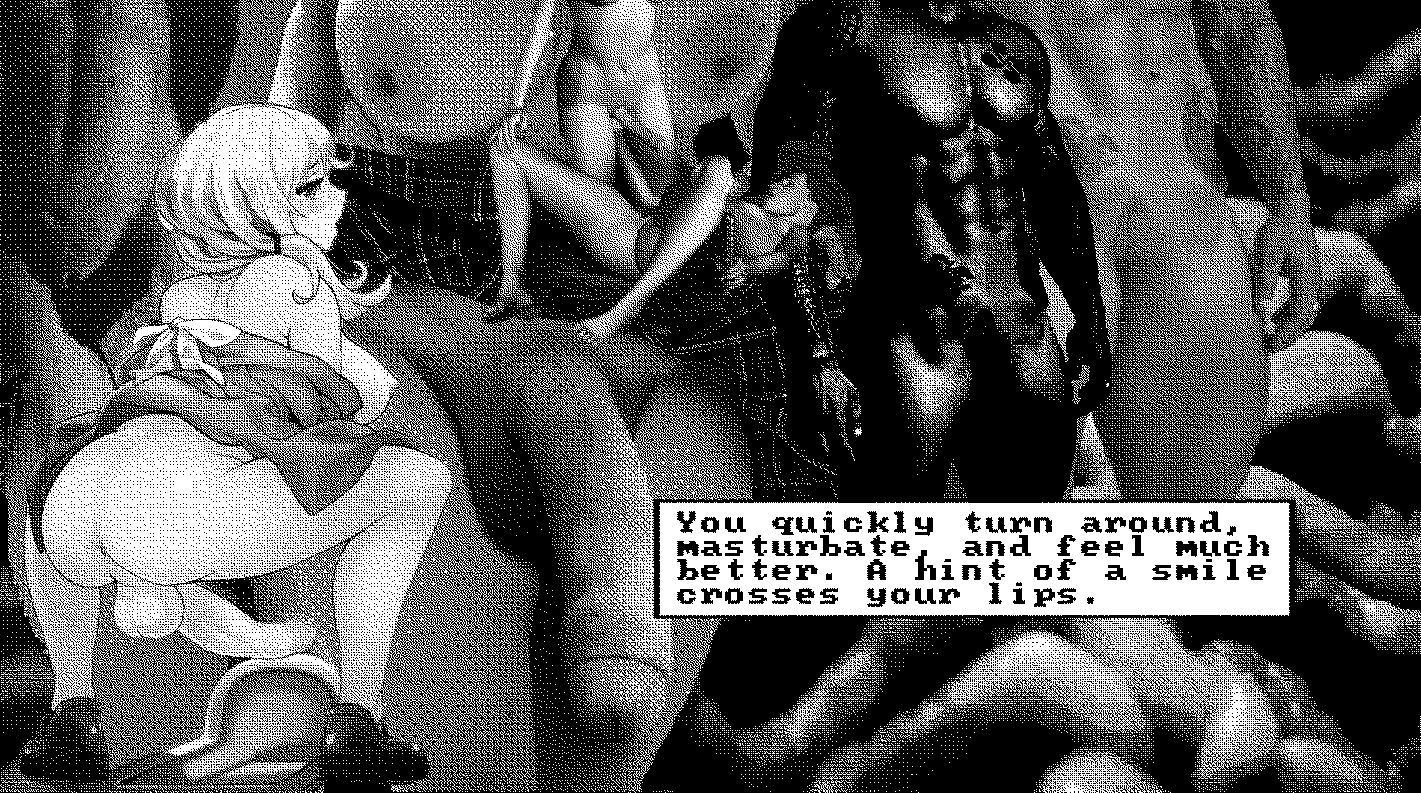
WEBMEAT by DEV
What are the limits, as you perceive them, to art as activism?
I think it's a hard line to draw. People who are heavily marginalized and oppressed on different axes are often creating art in their own spaces, online and offline, completely outside of activist communities. And yet their work is a unique reflection of their struggles and lives and can be a form of self-understanding, healing, or community building. And it's deeply intertwined with their difficulties accessing full personhood in society. I think anyone can debate endlessly on where the personal and political fall when it comes to how oppressed people make art that calls attention, purposefully or not, to their unique issues in life.
I work on a human rights commission for my city. It requires me to go out into my local community and help raise awareness for important issues like housing discrimination, anti-immigrant discrimination, anti-LGBTQ discrimination, restorative community justice, and similar. I don't necessarily think that any art I make can replace some of those interactions, many of which happen with people I'd not normally share a social circle with in the first place. Activist art can still speak to them, of course, but not always the sort of thing that I'm interested in or capable of making. I think art, while deeply personal, is also deeply cultural and there's no way for an activist outside of certain experiences to tap into a zeitgeist even if their intentions are great and they may have the same end goal as the people they're fighting alongside. I think that's why it's so important for people to invest themselves in lifting up the voices of the oppressed in activist and art spaces rather than attempting to speak on behalf of them. I think there's an unknowable quality to art produced for political activism just the same as anything else. It can't effectively be replicated by an outsider.
Where are your favorite places, IRL and virtual, to see art?
Part of the reason I was drawn to NewHive in the first place is that it's a sort of egalitarian art / digital collage site. A lot of established artists use it as an extension of their portfolios or online presence, but probably most NewHive makers use it in their spare time and have little to no professional experience with art, poetry, or whatever. I've had a lifelong interest in creating and collecting art but I got my degree in something completely unrelated and do something even more unrelated to make money, so it's one outlet I have of regularly expressing those interests and being creative. I also have what I jokingly call my "real life LOOKBOOK/Pinterest", which is just a big collection of clipped images from newspapers, magazines, ads, and all sorts of things. Magazines at my workplace get "stripped" and recycled when new issues come out, so it's like Christmas to me when I get a good haul of oversized fashion or art magazines. I love organizing and looking through these pictures and putting them up on bulletin boards or our fridge. Fridge art arrangement is an underrated activity.
I love seeing art in unexpected places out in the world. I'm a huge fan of people anonymously drawing or writing in random places, like in toilet stalls. I also love mail art, and receiving it; some of my friends do it and it's something that truly adds a personal and creative touch to something most people think of as routine or ordinary. Any art in the world that makes the mundane into something fantastic is exactly what I want to see more of.
On the street where I work, there's a "PUSH TO WALK" button at an intersection that has a bold black image of a pointing hand on it; tons of those buttons have that same image all around Boston and other cities. But on the one near my workplace, someone put a tiny silhouette of a cat stepping off the edge of the large pointing finger, which makes it feel very whimsical and a little surreal. I love art like that, especially when people add things to street signs and other public accommodations. It forces people to see something they wouldn't ordinarily think about, and it makes daily life a little weirder.
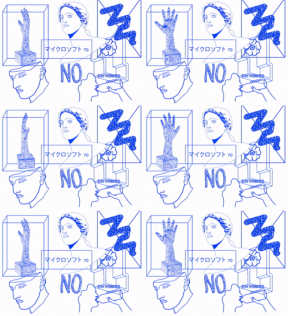
BLUE by DEV
What makes you feel free? What makes you feel trapped?
The spaces I cultivate online— like my Tumblr or NewHive —are sort of like home bases to me, and I feel free to be myself entirely on them. I'm very attracted to the idea of the internet remaining a space where anonymity is still possible, though that's more and more becoming not the case. I feel at home if I have access to these cultivated spaces where I can design things the way I want and post what I want. The idea of linking my Facebook to everything I do makes me feel a bit ill. Although, even my Facebook is a bit anonymous. I like it when people don't have access to everything about me. Some people solve that problem by having no online presence at all, but that doesn't work for me. I'm introverted and need an outlet for my collages and musings and film reviews or whatever. These things aren't locked away, but they also aren't easily accessible or things I provide links to between websites. I prefer it that way.
The idea of a fixed, recognizable, unchanging identity across multiple platforms scares me a bit. I would have hated to have come of age online in the sort of environment that pervades some activist spots on Tumblr, where things you posted as an ignorant or edgy pre-teen can still come back to haunt you years later. I feel like that's incredibly restrictive; that would make me feel trapped, if I used Tumblr for the same thing that many school kids these days do. When I joined in 2007 it was basically a website where people shared odd or interesting images or text posts on microblogs with less of a community experience. It's stunning how much it's changed in just under a decade. I'm also old school and still use LiveJournal, same as I did 13 years ago. The idiotic things I wrote as a 13 year old are long gone, however. That's definitely for the best.
Outside of the digital world, nothing makes me feel more free than traveling. If you're immediately established as "not a local" it's a lot easier to care less about what people think of you, because you'll probably never see them again anyway. It has challenges, as well, but I enjoy the benefits more.
If you could have a superhuman power, what would it be?
I think I'd like the ability to understand and communicate with animals. Although maybe just telepathically. I really want to know what my hamster thinks of David Byrne and the other artists and bands I listen to.